Imagine stepping outside on a cold crisp morning, speaking, and ice crystals gather in the air to form your words, a visual to your voice. Did you picture your words resembling text out of a book, or did you imagine more? Was your visual voice your personality in lettering and your character in characters? Were you there in the typography? Self‐infused language is far from an outlandish idea. It is perfectly natural. It is even expected. Everyone has a singular sounding voice, distinct gestural motions, and a unique writing style that creates personalized communication. All forms of communication rely on you as a one of a kind instrument, a culmination of body and experience. However not all forms of communication seek to personify the individual who is communicating; some have actively fought to sever the connection. Our narrative text has become disembodied from ourselves; hence our characters lack character when today our text could and should convey self.
SELF‐INFUSED COMMUNICATION
To state there is a
broken connection between narrative text and self, we have to prove the
connection existed in the first place. Voice is not simply an audible
phenomena; it is an all‐encompassing function of physical and mental
self‐expression. Pitch, timbre, accent, dialect, cadence, and
inflection of our verbal voice are the complete audible embodiment of
self. Our interaction with narrative text, both writing and reading, is
aided by our personal audible voice by subvocalizing. In Understanding Style: Practical Ways to Improve Your Writing, Professor Joe Glaser explains:
A powerful but woefully under-‐discussed influence on readers is the sound of written words, which they hear inside their heads as they subvocalize—[effecting] the mental processes of generating speech, but not actually triggering speech muscles or uttering sounds. As a piece unfolds, readers listen to this mental speech as if it were spoken aloud. What they “hear” is in fact their own voices saying your words, but saying them silently.
(Glaser 4)
subvocalizing is the connecting thread between audible and visual voice. Since subvocalizing is in our own voice, it makes our interaction with text in writing and reading a personal expression of self.
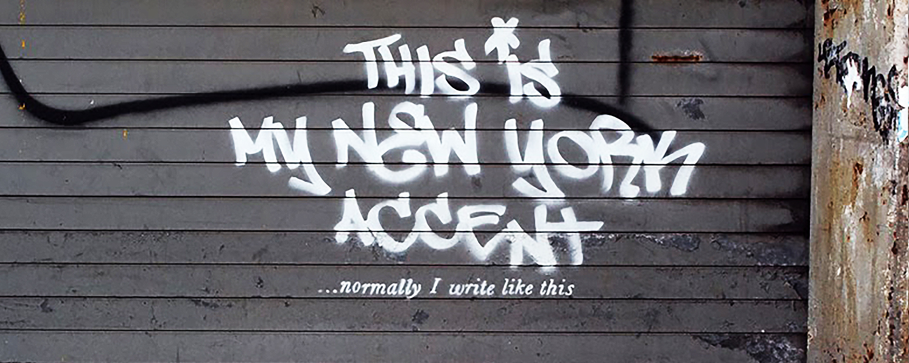
Everyone has a visual voice as unique as their verbal voice. Our handwriting is a way to display visual voice as a product of physical body, accumulated experience, and self‐expression. “Handwriting can give away clues to about 5,000 personality traits,” reported Victoria Woollaston in a 2013 study in graphology, “based on the way letters are spaced, a name is signed, and even the connection of ‘o’ and ‘s’ to other letters in a word” (Woollaston 1). Narrative text has developed technologically beyond only handwritten technique to include printed and digital text. These forms of communication require less physical interaction in the construction of the text, therefore depleting the occurrence of self. The visible mark and invisible space build a letterform and variations between these two factors produce context through singular differences. Modes of communication from handwriting to digital texting convey a vast range in levels of context dependent on the communication mode used. By the use of prefabricated letterforms in printed and digital communication context connected with communicator is destroyed and elements of self in text lost. It is through singular nuances in our personal language structure and form that we reflect our selves in our communication. Linguistic relativity theorist Edward Sapir quipped,
“If structure is at the heart of language, the variation defines the soul”.
(Sapir 345)
UNIVERSALIZATION: WORLD vs. SELF
Many regard the
shearing of contextual detail as signifying an evolution toward a
global community. Universalization is supported by the desire to
communicate faster and better everywhere. In typography,
universalization offers advanced digital flexibility and increased
accessibility of message for an ever‐expanding global market. Reaching
audiences regardless of borders, languages, and disabilities has
positive rewards. Jason Cranford Teague goes so far as to describe in Fluid Web Typography,
“It is a panacea to mass communication, globally offering a responsive
solution to any problem current or in the unforeseen future by
flexibility relegating text as tool of communication” (Teague 5).
Narrative text typography is one element sacrificed at the theoretical
altar of one world ideology and accessibility. In days past type form
was determined by graphic designers. Now a line of code can be entered
by a developer and applied in a style sheet impacting every aspect of
the typography for screen priority or audience need. Uniformity and
standardization strips away succulent author detail, regional voice, and
cultural context formerly conveyed in typographic nuances. The only
thing remaining is a stark minimalism of function for all in any
circumstance.
As the trend in universalization develops steam, must society reach a saturation point where it becomes absurd before we try to enrich our visual language with a cultural self‐expressive voice? Michael Twyman, social scientist and Professor of Typography and Graphic Communications, asks…
“Is there is a point in rhythm and readability, where it becomes too smooth in process to make a meaningful retention of content because the context lacks cadence and fluctuation due to universalization.”
(Twyman 12)
Our evolution of narrative text has not entirely been beneficial. Educators are now finding such repetitive uniformity of narrative text in print and digital is resulting in lowered retention rates among readers declared Twyman while presenting his research findings at the Monotype International 2nd Cambridge Residential Seminar (Twyman 2). With nothing more notable in form than the occasional bold or italic, narrative text is becoming as ineffective in content as context due to lack of comprehension and retention.
Accessibility is important to everyone but so are choices and moderation. In today’s world we need a solution that is a mixture of accessibility and self in context. With digital technologies maturing and capabilities expanding, reverse course and focus on finding ways to balance language by adding context to digital platforms. We must look inward to grasp a need for self-expression by an enrichment of context in digital typography rather than a quick communication. Today, the conversation moves toward the accomplishment of re-institution.
Many will argue for universalization saying without an audience, the message is mute. Yet, there are repercussions for this disengagement. Social linguist and cultural dialect scholar William Labov explains in The Atlas of North American English: Phonetics, Phonology and Sound Change,
“As the written language has progressed to universalization and minimized diversity, verbal language has progressed increasingly to a divergence of dialects and language variations almost to the effect of being an adverse reaction to the loss of written cultural identity.”
(Labov Atlas iv)
Language has a yin and yang balance in its aspects built to always preserve self. Verbal compensation has increased to maintain equilibrium of personal voice in reaction to the depletion of singular visual language. Before the visual voice was a mirrored reflection of the verbal through handwritten typographic elements. Now with the expansion of visual voice to canvas printed and digital communication, the self through context in narrative text is diminished and fading, and the verbal nuances of regional accents are heightened to compensate and balance self in our communication.
SOMETIMES ITS NOT THAT WE CAN’T, ITS THAT WE DON’T
In
countries where languages incorporate accent marks, there has been a
cry against linguistic distortion and loss of culture caused by the
proliferation of mobile devices related to social trends. With mobile
technology and the need for speed, diacritical marks are lost as people
fail to make the additional touches or clicks to place them in text.
These gaffes in visual language are thought a minor discretion or an
evolution in language. The acronyms like, OMG and LOL, and emoticons,
:o, have become universal in our lexicon out of the desire for quick
communication and newness of digital capabilities. The omission of
accent marks, however, is a shearing of culture and a butchering of the
visual and verbal language. These cultural embellishments, up to now,
were a source of national pride formed and documented during strong
cultural golden eras by the preeminent artists of their time. French
typographer Ladislas Mandel notes, “In 1531 France, over sixteen new
characters and phonetic values were created, with the help of Marot,
Geoffroy, Marguerite de Navarre, and Robert Estienne: accent marks
appeared to denote tonic syllables, diphthongs, the cedilla, umlaut, the
apostrophe, and mark differences between I and J, U and V, hard G, GH
soft, and the hard and soft C” (Mandel 117). These marks were, after
thoughtful consideration, added to written language to discern and
embellish regional culture through the addition of visual nuances to
reflect an intricate verbal language. Now they are carelessly ignored in
lieu of faster communication.
In colonized countries, accent marks have been used to denote cultural variation from region‐to‐region, especially notable after a country has gained its independence. These differences are sources of pride in nationality, region, and culture. They may be a way to accentuate cultural uniqueness by representing dialect and verbal variations from the language’s originating country. Sociolinguists and anthropologists have found Spanish dissemination in colonized regions of South and Central America and Caribbean Islands. The variations in the use of accent mark denote the vowel shifts from region to region and visual epitomize the dialects of the area. These small typographical symbols were the country’s visual soul that was retained and guarded during times of foreign infiltration and domination.
Modern innovations are prioritizing the desire for immediate communication over important cultural signifiers by discouraging the use of accent marks or special characters by requiring additional interaction. Once labeled as ignorance, missing diacritical marks are now accepted as a price of innovations in communications. As mobile devices have matured, accent marks and special characters have become easier to include. However, the damage has already been done with the general acceptance initiating the idea these marks are optional. In English speaking countries, the effect of innovation unwittingly shearing cultural details has not been so directly apparent. In languages with diacritical marks, cultural culling is immediately apparent in the distortion of content and context. The ambivalence puts these cultural marks in danger of becoming obsolete.
RESPONSIVE SOLUTION: SELF‐TYPOGRAPHY
Is there a
solution? How can we balance narrative text so it is readable and
enriched beyond its content? How do we regain our visual voice while
using the technologies we have become dependent on for communication? If
those are the questions you are thinking of then half the battle is won
by awareness.
Responsive text is the answer. Responsive is the new buzzword in digital design. In Webster’s Dictionary,
Responsive is defined as reacting quickly and positively or responding readily and with interest and enthusiasm.
Responsiveness sounds like a cure all. While it is not a solution, it is a means to a solution. With the maturation of digital technology, limitations are lessening, and unintended new capabilities are being discovered. Responsive text—interactive typography—could be applied as a solution in situations where context is missing. If the form and structure of text can be interactive and allow for customized variations, then context is present and a digital visual voice has been created.
Narrative text should not resemble hundreds of ants lined up on a page from a distance whether digital or printed. It should show character, personality, and be as engaging and inviting as the author or story. Our letters no longer need to be confined to tiny uniform boxes in tidy rows, like computer punch cards. In our digital world, we are the masters of each pixel that fills a screen. We need take advantage of this ability and control of our visual voice. With responsive typography the marks and spaces making up a letter would have non‐traditional flexibility. Busting out of the little letter prisons would allow for reflection of emotions, tones, volume, emphasis, and other personal nuances for enhanced meaning through context in lettering. Basic visual communication is soulless. One person’s digital communication or narrative looks no different from anyone else’s. Narrative text feels like the monotone voice of a robot, showing no inflection, cadence, or emotion. Responsive typography could overcome this sterility of narrative text by providing the capability for personal variations. These innovations in text would culminate in a self‐typography, injecting personal context in narratives.
CONCLUSION
Nowhere in our lives has less been done to stop the repression of self‐expression as in the standardization and universalization of our narrative text. We embrace our singular verbal tones and revel in our unique handwritings, but our narrative text, reading and digital texting is woefully ignored in lieu of a faster message. For centuries we have taken context in visual voice form for granted, slowly stripping letterforms down to appease communication innovations. Now we have reached the point where our narrative text is so bland and repetitive that our reading retention is suffering. This negative affect of too much uniformity is resulting in a decline in comprehension. Thus, content is becoming mute from the lack of context in the form succulent details and nuances in letterforms (Twyman 2). It does not have to be this way anymore. Digital innovations have matured to the point of capabilities in adding back context to our visual voice and self to our narrative text. We can be embodied in our digital visual voice. However first it takes an acknowledgement and desire to find ways to infuse you back into your visual language. Your personality can be present, but you need to get re‐introduced to your “visual voice” and the inherit elements creating character in your characters. This can be achieved by understanding, typography can and should be responsive, meaning it should provide a flexible environment where you can interact with the letterforms to place your personality in words beyond content to context. Responsive text could revolutionize literature by meddling the story with the typography by unleashing letterforms from their tiny tidy rows of boxes to express emotion and illustrate self in content for a richer narrative. It does not have to stop at reading text as digital texting can convey emotions without the use of gimmicky emoticons or acronyms, LOL and OMG, that are degenerating our language. We can develop apps with the ability to interact and construct text infusing our feelings and self into the letters for meaningful messages. The time is now to take an interest, ownership and pride in your visual voice, expect more from narrative language, and add character to your characters. Dare to visualize your interaction with text by infusing you in the conservation as a self‐typography, your emotions, feeling, and personality in letterform.