THE HISTORY OF FILTERING SELF OUT OF VISUAL VOICE
From the dawn of civilization, when hunting exploits were expressed on cave walls, to the texting telephones of the 21st century, we have slowly domesticated our narrative text to embrace uniformity. For centuries, context in form variation has been stripped from narrative visual voice for the sake of mass communication innovations which rely on graphic uniformity. These innovations or new methods range from political ideologies to technological advancements and their dispersal benefits have come at the price of whittled context and homogenized form and structure in text. As French typographer Ladislas Mandel explained, “The written cog of communication is typography and in it a paradigm has evolved over centuries between the succulent quality of form and the desire for quantity of message” (Mandel 109). Without the personal nuances of form, text loses valuable information about the writer, moment, and emotion, “rendering it personally barren and culturally bankrupt” (Mandel 109). This is a significant loss as a definitive secondary layer of narrative is missing without context, and meaning is confined only to content. Narrative visual communication has become more and more an experience solely in content. Today, our visual narratives, from reading text to digital texting, have become so uniform as to have no soul and convey contextual nothing of self, thus severing the connection in visual voice between narrator and narrative.

Early Evolution of Visual Voice
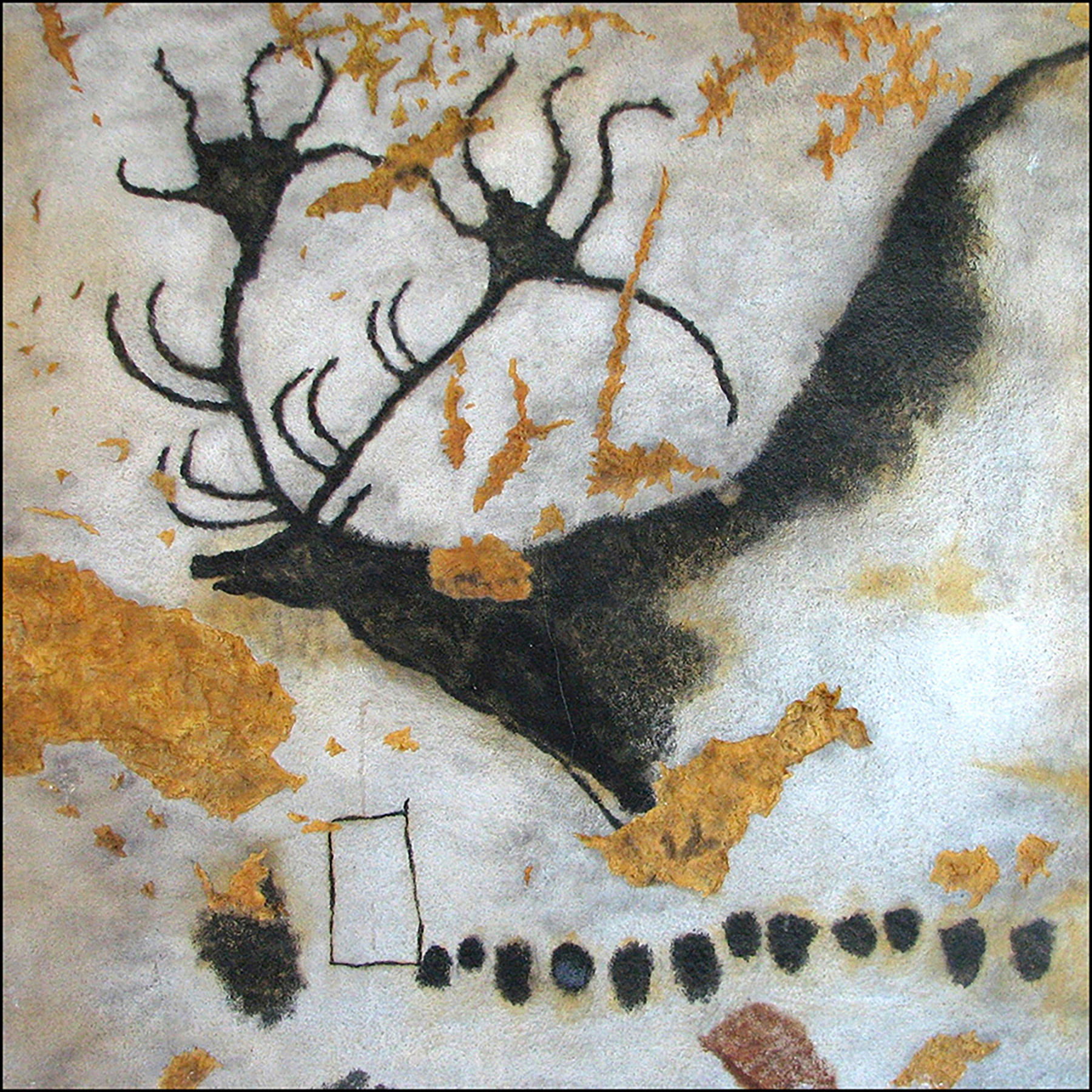
Let us start at the beginning of visual communication in the caves of Lascaux, France, where have been found some of the earliest forms of self-expression. “Elegantly detailed animal drawings, human figures, and symbols have been carbon-dated by Norbert Aujoulat’s archaeological team to the time of 17,190 BCE” (Archaeological Research). Such sparks of civilization are evident throughout the world. While the content and meaning of these primitive markings are still in debate, their contextual richness offers insight about the artist attained from archeological studies of form, style, technique, and media. Cave paintings are considered more works of art than forms of typography. Yet, they embody the beginning evolution of the visual voice, graphic communication through self. “Self expression is real only after the means to it have been achieved,” declared cultural historian Jacques Barzun in From Dawn to Decadence: 500 Years of Western Cultural Life (Barzun 25). From this formula of means and desire, prehistoric charcoal stick-drawn symbols on cave walls represent the beginning of self-expression in the form of a narrative visual voice.

With only verbal and gestural expression for language, the moment of communication was fleeting and a message became flawed, inconsistent, and even exaggerated over time. The Assyrians and Sumerians met this challenge by escalating a few key elemental signs into large collections of recognized symbols. By the development of specialized writing instruments, reed styli created standardized cuneiform symbols and originated the cultural visual voice of the Sumerian people. Reed styli literally made an impression on the visual voice by the unusual imprint it created. “Cuneiform means wedge-shaped writing (from the Latin, cuneus meaning ‘wedge’, and forma meaning ‘form’. Cuneiform was in use from around 3200 BC until the 2nd century AD” (The Tools of Writing). By establishing uniform, sharable, and lasting written form and structure, Assyrian clay tablet codex spread reliable political and commercial information throughout their empire and beyond. However, similar to the domestication of corn and wheat for proliferation, text symbols, too, were now confined and standardized in tidy rows, columns, and boxes for increased quantity and control. Innovations, political ideologies and technical advancements in tools and media start here to necessitate the reduction of context in form and self in narrative text for broader reliable mode of communication.
The Phoenicians were one of the first civilizations to evolve cuneiform symbols into an alphabetic system of 22 symbols, connecting sounds with symbols. Paring symbols caused actual form and context to be lost forever. The number of symbols lost could have been staggering in number but no one knows. Gauging from records of similar figurative symbol-based languages, the World Language Encyclopedia estimates there were 700–800 basic ancient Egyptian hieroglyphs symbols and “the ancient Chinese Hanyu Da Zidian compendium had 54,678 symbols” (José de la Luz Sáenz Garza). Thus, the cultural innovation of phoneme-based alphabets was a considerable evolution of language and a massive loss of cultural symbolism and historic record. Here forms were not contoured but rather eliminated all together.

The streamlined Phoenician alphabet spawned numerous visual language variations resulting from ease of communication and expanded trade contacts. Each culture shaped their visual language to address ideological needs for communication. “The Greeks freed from the constraints of the figurative alphabet and letters schematically reduced them to simple geometric and harmonious shapes, like their culture” (Mandel 53). Simplification of Greek letterforms made them easier to recognize and replicate with brush and ink. These new forms were used to keep scholastic and governmental records, both fields where Greeks were innovative leaders. The Romans, on the other hand, wanted a visual language to announce their conquests at the top of buildings and temples, “monumentalizing their written language” (Mandel 68). Hence, they used chisels to sculpt forms creating a different looking angular alphabet suitable for carving into stone. The Romans also desired readability at a distance and introduced standardized spacing between letters and extra spacing between words. Each culture has created innovations in their visual language through technology and methodology reflecting its own particular evolving cultural. Visual language elements appealed to society’s self as a mirror of their collective visual voice and satisfied particular cultural ideologies for mass communication.

Most enduring languages come from regional and religious empires. These empires promoted their language and obliterated those of occupied areas in shows of military and cultural prowess. For example as Ladislas Mandel points out, “Charlemagne imposed exclusive use of Carolinian minuscule in his empire, covering all of Western Europe leading with Christian reformation of all schools and monasteries scriptoria” (Mandel 85). To the victors go the spoils, and language is an important cultural commodity, marking territory and combining regions with a common culture. Language can also be the voice of freedom; some societies have reclaimed original languages after dismantling foreign control decades later. Many languages have been lost completely as a result of cultural infiltration. Others have been integrated to make new regional dialects displaying an enriched cultural history. The language of a culture holds strength in community by a common bond of communication. An individual’s language, written and verbal, is impacted by the collective history of the region. Language is a fluid and flexible phenomenon influenced by and a mixture of experiences, just like people. A visual voice can represent many cultures and experiences in context through form and structure. Empires repressed, impressed, and progressed cultural self in visual language depending on the particular history of a region.
Innovations in Narrative Text

The Catholic Church held a literary monopoly on Europe in the Medieval Ages as monks trained in typography and artistry were the leading producers of literature. Handwritten in Latin, illuminated liturgical manuscripts sculpted context into the content with innovative graphic embellishments. These monks, while working in the confines of religious written doctrine, mixed creativity and context to personalize each page. The Book of Kells is one of a small fraction of surviving illuminated manuscripts. Françoise Henry, 20th-century historian of Irish art expounded, “three scribes simply labeled Hand A, B, and C that penned The Book of Kells’ scripture in brown, red, purple, and yellow ink in an insular majuscule script with some minuscule letters usually ‘c’ and ‘s’ (Henry). Each scribe had a unique personality evident in the context of the typography and construction of content. “Completely unique to The Book of Kells is the way to which it is hyphenated. Letters that would not fit on the line would be lowered or heightened to the margin and an illustrative animal would call note to the additional letters position” (Brown). This personalisation and regional sculpted typography continues today to be connected to the Celtic culture as The Book of Kells is considered a national treasure of artwork and typography. The innovative context in the written form and structure of these monastic masterpieces showcase visual voice and religious beliefs mixed in an artistic endeavor of self. Where religious restrictions demanded uniformity in narrative text, context of self flourished through the creative control the writer had in creating handwritten content.

Creative context in visual voice changed in 1439 wen Johannes Gutenberg innovated a printing process. He altered a wooden screw grape press into a printing press, concocted a tar-based ink, and created a metal movable type system. Gutenberg’s Bibles demonstrate type mimicking the style of handwritten manuscripts. This was done to meet the expectation and taste of patrons. “To achieve this look he handcrafted 300 letterforms in a soft lead alloy replicating the look of the Blackletter calligraphy prevalently used in handwritten religious manuscripts” (Heil). Such a manufacturing feat allowed for a critical decrease in production cost and time. However, the economic benefit and mass production sacrificed many rich contextual details of the text evident in illuminated manuscripts. Gutenberg’s process “revolutionized dissemination of writing as print, drawing from the memory of writing, frozen in a somewhat structured and developed homogeneity,” disparaged Ladislas Mandel, “and lost, the trace of writing details, some of its almost sensual approach, a bit of its humanity” (Mandel 109). It certainly ignited the Renaissance Age and increased literacy across Europe. However, artist Paul Ellington comments this change also relegated “typography as a language of production” (Rock 80) rather than an artistic communication ofself. Before Gutenberg’s process each letterform were handcrafted by the writer. Here only a select supply of medal letterforms were handcrafted to accommodate a single page and reused. These prefabricated letters took the writer’s self out of narrative completely in exchange for quantity in a faster more cost efficient mode of mass communication.
By the late 1400s, Gutenberg’s printing innovation was propagated through print shops in most major European cities. Books of this time were printed in Latin at international publishing houses in Cologne, Paris, and Rome. As a result, a growing upper class was demanding vernacular texts and secular stories of an entertaining nature. To chronicle one country’s evolution in cultural printed language, William Caxton is credited with bringing printing to England. “Caxton modeled his English type set after the sumptuous hand lettering of David Aubert, who was writing manuscripts for Margaret of York. Caxton’s new type incorporated special English features in comparison to Latin and French, such as the letters ‘w’ and ‘k’ and the unique flourishes at the end of letters” (Blades 38).

“Johann Veldener is credited with designing the type set, littera bastarda, for Caxton” (Skeat v). By 1476, Caxton had set up England’s first print shop, translating literary works into English and printing books such, as the English masterpiece, Geoffrey Chaucer’s Canterbury Tales. With new vernacular letterforms and treasured national literature, cultural pride grew. People came to recognize differences among cultures evidenced by their visual elements which were showcased as printed visual languages. These printed visual voices represented typographic nuances in forms and structures mirroring the vernacular languages. As Latin was the language of scholarly writing, the printing presses of Caxton and others melded handwritten cultural typography into printed forms. These communication innovations, while stripping self from printed narrative text, sculpted cultural self in manufactured text reflecting verbal and cultural nuances visually.
Revolutions in Cultural Text

With printed communication, instead of the writer’s handwritten self-expression impacting a narrative there was only the context made by the type forgers and printers of a certain area as they constructed letter and page forms. Printed self-expression became standardized in form and regional phenomena. With print typography mimicking regional handwritten letterforms; some fonts are still inherently linked to an area for example, Unical with the Celtic and Blackletter with Germanic heritages. Cultural language became a commodity of cultural strength. All classes in society wanted to partake in the power of their cultural visual voice. This appeal of a cultural language was strongly illustrated after the French Revolution.

“With a bloody revolution in France seemingly creating a blank slate for a new French culture. The people, void of a restricting ruling class aristocracy, were outraged at new typography in newspapers. People wanted to keep their cultural visual voice, Garamond, but unleash the knowledge of language by increasing literacy for all classes of society” (Mandel 139). Cultural language is a treasure. Visual voice, handwritten or printed after the mid 1400s, is a masterpiece with varying degrees of cultural context.

In the 1940s and 1950s, the Germanic region was bustling with ideas of simplicity and universal typography. The neutral artistic movement of International Style flowed from the ideology of the Swiss School of Design. “Led by designers Josef Müller-Brockmann at the Zurich School of Arts and Armin Hofmann at the Basel School of Design, style favored simplicity, legibility and objectivity.” (Müller 15) “The German International Style cultural movement introduced Akzidenz-Grotesk sans serif type” as professor Philip Bertheau explained in The German Language and the Two Faces of its Script, “as a cultural cleansing for an international market in an industrial world” (Bertheau 56). With san serif type, all typographic embellishments were cut to produce a simple geometric block lettering culling all cultural indicators for the first global typography. At this time, the ideology is purely cultural in nature and a response to a new global reality resulting from the Industrial Revolution. This is the first conscious extreme reduction of context in typography for the sake of universalization but not the last.

International Design dispersed as Hitler’s Nazi Party closed many of the design schools, banned the international ideology, exiled and imprisoned educators, and mandated the cultural Germanic typography to be Blackletter. This was the only font sanctioned by the Nazi Party in Germany. Adolf Hitler recognized cultural language as a commodity of cultural strength. The Nazi Party tainted the rich contextual Germanic national heritage typeface of Blackletter. “By instituting forced control over the written language and saturating its context with the horrors of war and acts against humanity with the Holocaust. It tainted the type of Gutenberg’s Bible” (Heller 45). Self demonstrated in typography can be a plow cultivating meaningful form or sword, stifling context to propagate a prescribed cultural identity. Political and cultural ideologies and innovations shape region and language through the influence of perception and comprehension of self.
Progression to Digital Text

With books, magazines, and newspapers, printed text was a capability of government and business, relegating personal correspondences and narratives to the more causal form of visual voice, handwriting. Printed typography was held in the hands of professional type designers, as printed communication was a guarded professional business. In 1860 typewriters introduced printed text capabilities to the public. The serif monospaced Typewriter typeface was space functional and replicated the printing press style of movable type. The original typewriters created infinite pages with one set of uppercase letters, numbers, and punctuation in 40 characters. As all technologies, typewriters evolved encompassing lowercase letters and a multitude of additional symbols and creating the standard keyboard layout facilitated today. Typist added context in text through idiosyncrasies due to the machine variations, manufactures, and typists’ key pressure. As with other writing instruments, the physical body and culminated experience of the typist and typewriter created a singular self-expression in print reflecting emotion and personality in the communication. Narrative text form and structure developed as a personal automated interaction between machine and user.
As personal computer technology entered the scene in the 1980s, type was freed in form and style, purportedly for the better. Experimentation was rampant, and readability became a casualty of design zeal and ego. Type form was at the fingertips of anyone with a computer. It was not limited to the educated typographers of traditional type foundries. Typography, color, and form became an experiment to push the boundaries of what could be created with limitless options. Unfortunately self was lost in the process and text was no longer linked to cultural voice. Form became freeform with thousands of typefaces introduced. Innovations in the technology of written communication have an impact on our relationship with text. The development of digital text has dramatically changed the way we interact with the written word. Contextual details became separate from author, region, or content; textual experimentation was expressed in mood and in broadened digital capabilities.
Innovations have a process of checks and balances. They tend to need time and start simple growing complex with maturity and knowledge. For example, Opensource accessibility and ever-expanding technologies in innovative software and hardware make font creation and distribution easier and more accessible. Ladislas Mandel considers this a cultural plight as he countered, “Today everyone can buy cheaply in IT supermarkets housing tens of thousands of characters whose cultural or functional origins are elusive… providing industry, too often ignorant or unscrupulous users, a dangerous weapon” (Mandel 223). Accessibility to typography is a problem of the past; over accessibility to typography is a problem in our future. Context is meaningless in a flood of typography with no anchor to a self.With all of these new fonts at our fingertips the counter balance is technological innovations in mobile devices, website design, and accessibility trends limit the rendering of text. Designing for a global community has its drawbacks as it requires the selection of typefaces to be fonts the majority of computers have originally programmed across brands and formats, Apple, Android, or PC. Digital media and its proliferative impact on communication have been compared to Gutenberg’s printing process as the audience is ever widening and making a profound impact on how we communicate. The Digital Age with its global reach in communication has had a social and cultural effect with a trend in universalization. This global oneness drains the last drops of context in digital text for the sake of accessibility in a global community and at the price of self-expression.

For centuries our narrative text has been dwindling in contextual form to accommodate the needs of innovations, from cultural ideologies to technological advancements. As a society we have chosen time and time again fast, far-reaching communication over quality message. Our narrative visual voice is now only a skeleton of the once salient and rich contextual form that mirrored the emotions, moment, and personage.
- “Archaeological Research: The Work of Norbert Aujoulat 1988-‐1999.” Lascaux: Visit the Caves. Lascaux.culture.fr. Online.
- Barzun, Jacques. From Dawn to Decadence: 500 Years of Western Cultural Life. New York City:Harper Perennial, 2001. Print.
- Berthold, Louis Ullman, The Origin and Development of Humanistic Script. (Rome), 1960, p. 12. Print.
- Bertheau, Philip. ”The German Language and the Two Faces of Its Script: Genuine expression of European culture?,” Blackletter: Type and National Identity. New York: Princetown Architectural Press, 1998. Print.
- Blades, William. The Life and Typography of William Caxton: England’s First Printer. Cambridge: Cambridge University Press. 2014. Print.
- Brown, Michelle. “The Book of Kells.” History Channel. Documentary, 6 parts. Video.
Garza, José de la Luz Sáenz. - “Chinese Calligraphy: The Art of Writing.” The Hutong Language School in Beijing. Beijing: 20 July 2012. Online.
- Glaser, Joe. Understanding Style: Practical Ways to Improve Your Writing. Oxford Univ. Press, 1999. Print.
- Heil, John. “Traces of Things Past.” Philosophy of Science, vol 45, no. 1, March 1978. Chicago: Chicago Journals. Print.
- Heller, Steven. Iron Fists: Branding the 20th century totalitarian state. London: Phaidon Press, 2011. Print.
- Henry, Francoise. The Book of Kells: reproductions from the manuscript in Trinity College, Dublin. London: Thames and Hudson, 1974. Print.
- Labov, William, Sharon Ash and Charles Boberg, Atlas of North American English: Phonetics, Phonology and Sound Change. Berlin: Mouton de Gruyter, 2005. Print.
- Mandel, Ladislas. Écriturés, mirror des homes et the sociétés. La Tuiliere: Atelier Perrousseaux, 1998. Print.
- Maschmeyer, Leland. The New Generation. Type Directors Club Designer Series, March 22, 2015. Video.
- Müller-‐Brockmann, Josef. Pioneer of Swiss Graphic Design. Zürich: Lars Müller Publishers, 1995. Print.
- Rock, Michael. Multiple Signatures: On Designers, Authors, Readers and Users. New York City. Rizzoli, Print.
- Sapir, Edward and David G. Mandelbaum. Culture, Language, and Personality: Selected Writings. Sacramento: University of California, 1986. Print.
- Skeat, Walter W. Rev. “The Canterbury Tales: Text.” Oxford: The Clarendon Press, 2007. Print.
- Teague, Jason Cransford. Fluid Web Typography. Thames: New Riders, 2009. Print.
- “The Tools of Writing,” The British Library. London: 20 July 2009. Online.
- Twyman, Michael. “The Graphic Presentation of Language.” Information Design Journal, vol. III, no. 1. Print.
- Unger, Gerard. While You’re Reading. New York: Mark Batty Publisher, 2007. Print.
- Wheeler, Alina. Designing Brand Identity: the essential guide for the whole branding team, Ed. 4. Hoboken: John Wiley & Sons, Inc., 2013. Print.
- Woollaston, Victoria. “What does your handwriting say about you?” DailyMail.com. London: 29 July 2013. Online