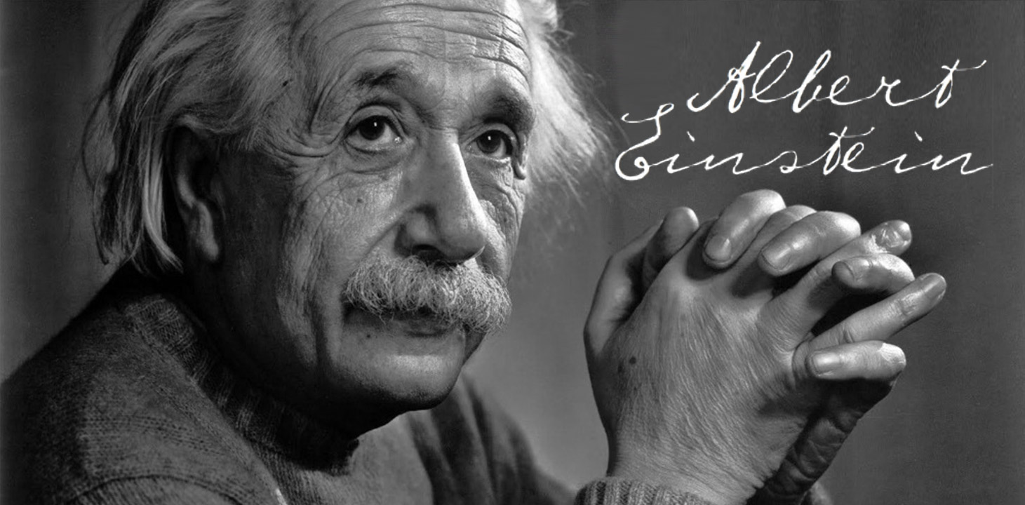

Celebrity Type
There are incidents in which cultural and true personal identity are being revived in typography. Typefaces are being formulated based on the archival writings of famous people throughout history. These typefaces are built from letterforms gathered from handwritten documents and ultimately assembled into typographic collections. This is done to represent the self‐expression of the celebrity. Unfortunately, this patchwork of lettering captures a sense of the person—better than nothing, but only a faint glimpse into the person’s self. By collecting only the prescribed amount of letterforms, the need to reference other documents for missing letterforms convolute the emotions and creates a jumbled context. In point, Napoleon’s love letters to Josephine were penned with a different emotion and feel than he conveyed in the visual text of a governmental edict. Mixing the two dilutes the integrity of the self‐expressive visual voice of the French leader. The fixation of one letterform per alphabet character strips the undulating mood, tempo, and personality of the visual voice in the narrative. It is similar to the process of digital typography and even Gutenberg’s movable type in it only represents only a fraction of the context available. Celebrity typefaces are more like a ghost of the celebrity’s visual voice.
Corporate Type
Corporations are creating their own typography as a means to achieve self-‐branding in a blend of message and meaning. Branding author of Designing Brand Identity, Alina Wheeler explains,
“Typography is a core building block of an effective identity program. A unified and coherent company image is not possible without typography that has a unique personality and an inherent legibility”
(Wheeler 154). In a natural progression toward controlling the corporate look, branding has extended beyond cultivating emotions and personality by logo, color, and form only to proprietary typography. Gone are the days of designating or reflecting the inherent feel from a pre-‐existing typeface. Corporations are going one step further creating typefaces solely to reflect corporate mission and message. “Wolff Olins designed Tate typeface for the firm Tate Modern in London; Insigne Design designed Chatype typeface for the City of Chattanooga Tennessee; and Matthew Carter designed Yale typeface for Yale University” (Wheeler 154).

These various corporations and institutions have acknowledged the power of personal visual voice and seek to achieve personality in a brand through typography. This represents a progressive evolution in the use of typography’s graphic nuances as corporate indicators. Corporate visual voice is similar to cultural in the fact it represents a group of people in this case employees. However, a brand’s visual voice is not cultivated through history and shared experience it is sculpted out of desired personal traits to gain a trust though more to the nature of a marketing ploy.
Variations of Glyph
Typography can also be enriched with self‐expression through collections of multiple letter selections and glyph variations in the same typeface. These options speak to the desire for various feels and emotions formed in a single letterform. It also gives rise to the possibility of creating a richer context and narrative through optional letterforms and combinations of letters. The advanced glyph collections answer a demand for ways to enhance the narrative by adding context through variety in visual elements. Variety in glyphs and characters pushes the conversation on the need to expand alphabet forms for contextual considerations. However, much as we found with celebrity handwriting typefaces, this possibility provides only a glimpse of the contextual information available in handwriting. It is a step in the right direction with context being conjured by multiple letter variations to reflect a self by letter selection and a personality in the character array. These expanded collections are rare to find. Also, the collections are considered expanded only comparatively to standard typefaces which reasons they are still rather limited. With digital technologies maturing there are other options on the horizon.